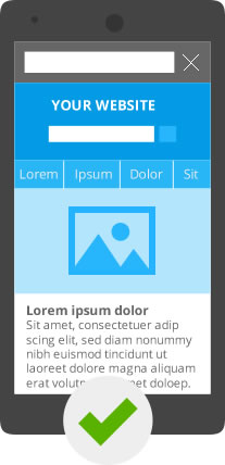
Not only web sites need to be considered. All apps are now being developed with mobile devices in mind. Whether it is a smartphone, a tablet, or a netbook, your apps and website content needs to be flexible. It needs to be presented to meet the technology being used to view this content. Initially, that meant that content needed to be re-purposed so that it could be read on a small screen. This meant effectively two or more sites,. Each with the same content delivered to different devices. Very difficult to keep in sync, both in functionality and content accuracy.
Designers today are building content and functionality once. They use a presentation layer to deliver the content. It is delivered in the proper format for the device being used to read the post. This is the way WordPress and other content management systems are now working.
When someone comes to a website to view content, information is sent answering the basic request. As well as indicating the type of device that it will be presented on. With the appropriate app installed as part of the WordPress content management system, the content will be presented to fit the screen of the reader.
This site currently uses Jetpak and one of the apps residents in Jetpak to configure all content in the appropriate manner for the device used to read it.
Readers will spend less than a second looking at content that is too small for them to read before moving on. Don’t waste an opportunity, prepare your site for mobile viewing.
For more posts about business websites, click here.
There is a great deal to look after if you are operating a blog. They…
What is SEO? First of all SEO is short for Search Engine Optimization. It is…
What are XML sitemaps and why are SML sitemaps important to web sites and their…
There is a check list of common SEO mistakes to avoid when you are designing…
Building a web site and a web page is actually quite a complicated challenge. There…
Most people will just ignore concerns about online privacy until their privacy is personally compromised.…